
Why Proposal Graphics Are Your Lifeboat in a Sea of Text: Winning Proposal Graphics Part 1 of 2
Let’s face it. No one looks forward to reading proposals, especially Federal government proposals. Evaluators brace themselves for dry, text-heavy documents, their contents difficult to read and absorb. Often, the story, messaging, and value offered in the proposal is swamped in a sea of text.
Graphics can be a lifeboat.
First, they make a reader feel safe to dive in. A well-designed cover and interior graphics offer more than just visual appeal. They break up pages and make long blocks of text less daunting. Second, they quickly convey key concepts about your solution. A well-constructed graphic doesn’t just “look pretty.” It clarifies your approach, showcases why your company should be selected, and relays your key proposal points.
Graphics are just as important to creating a corporate perception as the content in your proposal. They should be an early part of your proposal strategy. A professionally designed cover and executive summary tell the evaluator they can relax, you are in charge of your story, and you’ll make their job easy.
In Part 1 of this series, we review the many different uses of graphics in your proposals. Then in Part 2, we’ll explore practical tips for their creation and use.
Proposal Covers: Making the Introduction
A proposal cover is not an afterthought or window dressing. Instead, think of a cover as the first impression your company makes to an evaluator. What does a cover provide?
- Compliance and information. Some requests for proposals (RFPs) may have specific requirements for cover content, so compliance is a priority. If there are no requirements, this is still where you put information on your company, the contact receiving the proposal, the name of the agency or organization soliciting the work, the date, the number and name of the solicitation, and most importantly contact information. Put the name of the highest-level person of your company authorized to negotiate along with their phone and email address. Make it easy for the government representative to reach out if they need to.
- Company branding. Your logo, palette, and aesthetics are on display on your cover and establish your design for the rest of the proposal.
- Your understanding of the work and the client.Your choice of photos or other design elements sets the theme for your proposal. What mission will you support? Whom will you be helping? What tasks will you be performing? Customizing a cover for each bid is an easy way to show the customer you’re already thinking about them, not just repurposing a template.
Executive Summaries: Your Elevator Pitch
If covers are a first handshake, an executive summary graphic is your first meeting. Here’s where you really begin to show the winning themes for your proposal. Use them to establish:
- The facts. This is a good place to showcase your company’s set-asides (e.g., Small Disadvantaged or Veteran-Owned Small Business), awards, certifications, as well as housekeeping items such as a DUNS number or CAGE code.
- Differentiators. What factors make your value stand out? Previous experience with the client or with similar work, knowledgeable staff, or subject matter expertise and reachback all count.
- Understanding of the client. Use this graphic to swiftly show your understanding of your client’s main challenge and how your company is the solution.
- Understanding of the RFP. A succinct summary of the client’s needs and mission, along with relevant stock imagery, can demonstrate your understanding.
Graphs and Charts: Complex Information in a Hurry
The bulk of a proposal may seem like pages and pages of text, and it’s easy for critical points to
be lost. Evaluators have limited time and may even skim through many parts. Graphics draw the eye to information you want to highlight, breaking up the sea of text in a compelling way.
The widely used Shipley proposal process recommends a minimum of one graphic on every page of your proposal. When thinking about what graphics to create, think about what the most critical information on each page is. Graphics can convey critical information about your win themes, your success factors, your solutions, and your approach. They complement and enhance your text, and oftentimes can replace text by more succinctly conveying a message. Graphics are sometimes the only way to display critical organizational or technical information. Examples of graphics follow:
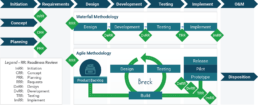
- Technical. System or process flowcharts can be critical for highly technical/IT proposals.
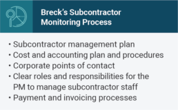
- Organizational. Displaying your proposed team and management structure is simply easier in a graphic chart. Graphics are also the way to go to show a necessary process (new employee onboarding steps or quality control steps).
- Past Performance. Statistics and metrics from past contracts; quotes or testimonials; compelling stories and anecdotes can beef up otherwise dry descriptions.
- Photos. Used sparingly, they can create emotional engagement. Staff photos turn names into people; photos of successful projects inspire confidence.
- Theme/value points. Graphics that highlight win themes and your company’s value-added features can help bring the surrounding text and concepts to life. Examples could include a graphic showcasing your company’s six factors for risk mitigation, or your three-part approach to retaining great personnel through transitions.
In our next post, we’ll discuss practical tips for coming up with ideas, creating, and using graphics. If graphics sound like an overwhelming addition to an already stressful project, proposal graphic designers and writers can work with your ideas to develop compelling images that make the difference.